
Radio
Propagation Information
Useful Links
The Australian Ionosheric Prediction service LINK
T-Index
menu
The
T-index chart: This image shows the DIFFERENCE between
current OBSERVED HOURLY conditions and PREDICTED MONTHLY conditions
for the Australian region. The colours blue, green, yellow, red,
correspond to "enhanced", "normal", "mildly
depressed" and "depressed" conditions respectively.
Depressions and enhancements are with respect to the IPS predicted
monthly T index for that month.
The
real time
Ionosonde.
Sorry
I can't embed this active picture here. Click image to go to the
ionosonde page and select "Hobart" or
similar to see the layer conditions and find out the vertical MUF.
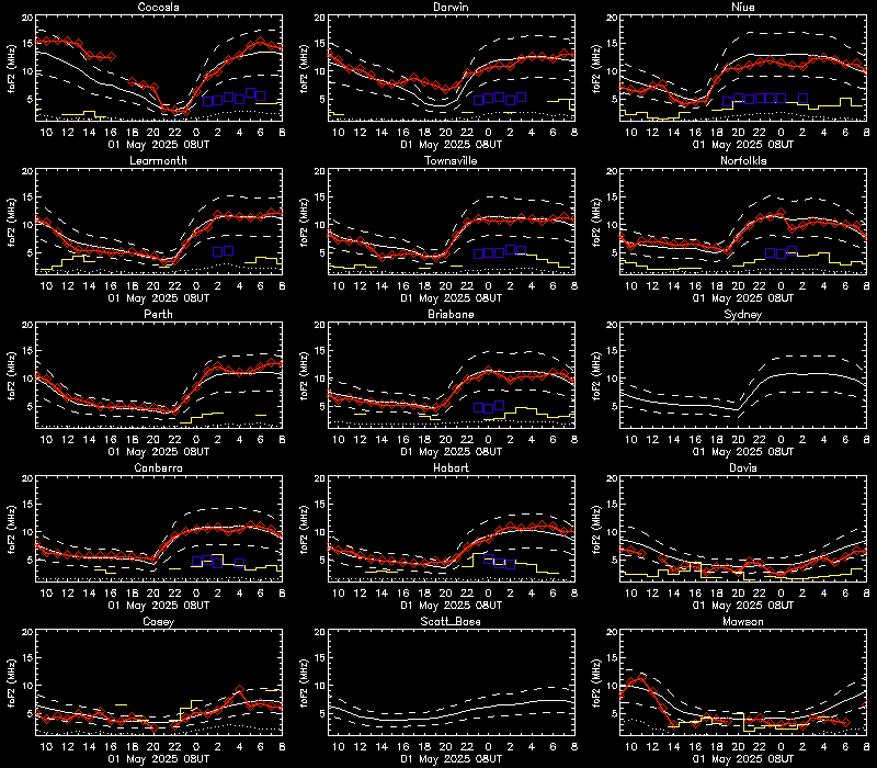
This is a sample picture
FoF2
layer trends
See
the MUF of the layers trended
Legend: White
solid line indicates monthly predicted foF2. White dashed line
indicates monthly predicted foF2 +/- 30%.
Red solid line
indicates hourly observed (autoscaled) foF2 from that station.
Yellow solid line indicates sporadic E (foEs).
Blue squares
indicates hourly autoscaled foF1 from that station.
Ionosperic
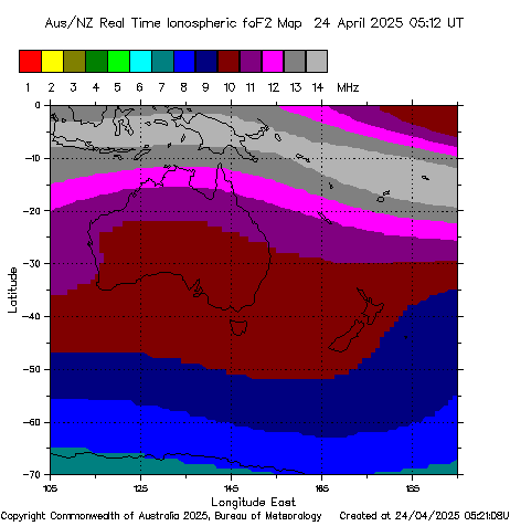
map
Shows
current vertical MUF across australia.
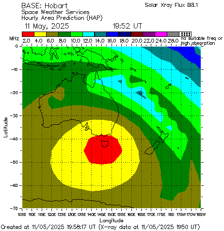
Hobart
HAP chart
Shows
the "real time" best frequency to use to a nearby
destination from Hobart.
link
to Other
Charts
Global
Hap Charts
From
http://www.solen.info/solar/
What the trends are:
Black
line is solar flux, 60 is about as low as I have seen it at solar
minimum.
A
good sunspot cycle can see numbers over 160
Blue
line is planetary A index, a good measure of how disturbed the
ionosphere
is.
Below 10 gives stable propagation conditions.
Red
Line is sunspot numbers.

FOR
THE VHF / UHF OPERATOR
Link
to Hepburn
Charts
For the graphic guide to tropospheric ducting
